When all you have a hammer everything looks like a nail. What happens when you have an entire bag at your disposal? Let's take a look at a case where a multitude of options exists for a simple task. That task is to animate a page element to bring an interactive experience to an otherwise static layout.
Before getting started let's dig into a hypothetical problem. Imagine a web site with new articles, images, or other content in a gallery format. In this case it is a list of story teasers with links to the full article. Based on any number of existing plugins like jCoverflip this demo looks at one feature. When the user mouses over an article it should grow. When they move away again it should fade back into the background.
A good foundation
 HTML prototype for example contentOur tools today will be additions to the CSS3 specification. In contrast a future article will look at how the same effect can be achieved with one of the popular Javascript libraries - jQuery. As these are relatively new this means that your mileage may vary depending on your browser. If you are reading this in Internet Explorer the demos will probably not work at all. Those using Firefox will see slightly different effects than the Webkit based browsers (Chrome and Safari). If you have all three platforms available I highly recommend doing your own compare and contrast.
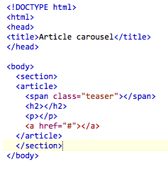
A lightweight HTML5 prototype is all we need to play around. Using the <section> element along with <article> it is trivial to construct a structure for holding all the information we need. The only difference in a live demonstration might be that rather than a <span> you could directly embed an image.
Once the CSS has been applied the final result looks like the design below. To fade it into the background the opacity has been set to 50% by default. Likewise the border-radius rule has been used to give soft edges to everything. Otherwise the rest of the rules should be familiar to anybody who has worked with positioning elements.
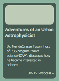 Example article with basic styles applied
Transitional logic
To scale the active article using pure CSS requires using the :hover psuedo-class in conjunction with either transition or transform. Let's dig into transition first since this works in Chrome, Safari, and Firefox. Unfortunately for those using Internet Explorer they are out of luck (at least with current releases).
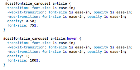
The transition rule allows a designer to specify changes to specific rules or everything at once. In addition the timing can be specified to indicate how long the animation should last. We need to use it twice to achieve the desired effect - once for the default state and once again for when the mouse passes over. Here's what we need.
 Applying CSS3 transition rules
In this first instance we achieve the growth by changing the font size from 75% to 100%. Since everything is specified in terms of ems this means the entire article will grow by a third. The all property could have been applied just as well but this approach demonstrates that you could apply effects at different rates if you wanted.
The end result can be seen here. Try opening it in both Chrome and Firefox to see the way that the browsers behave. Firefox grows smoothly whereas the animation in Webkit is decidedly more choppy. Clearly we need a different approach for Chrome and Safari.
Transforms - more than meets the eye
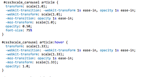
Cloning the list of articles to add another column and giving it a unique id ('css3scale_carousel'). To growing the articles with approach we need to rely on the new transform property. In particular the scale method should give the best results. The CSS rules that we need are
 CSS3 transformations in action
Be careful when deciding on the scale as there may be unintended consequences. In this case, with a fluid layout, the space reserved for the element is the same regardless of whether you are hovering or not. As a result if you do try simply scaling the default state to 75% the spacing between articles will render very strangely.
We can now compare transition versus transform in this second example. Mozilla does not support transitioning the -moz-transform property so immediately you will notice a difference. On the other hand Webkit allows you to apply rules to any arbitrary property including vendor specific extensions. Notice how much more smoothly the growth and shrinking occurs in Chrome. Those using Internet Explorer are once again out in the cold. I have not done any formal testing but I suspect it will immediately jump from 50% opacity to 100% as soon as the element is moused over.
Coming attractions
In the second part of this exercise we'll supplement the pure CSS3 implementation with a version that works across all browsers. Because of the fragmented nature of the browser environment we need to look to Javascript libraries to provide an experience that is the same across Internet Explorer, Safari, Chrome, Firefox, and hopefully a majority of other browsers based on Webkit or Gecko. Stay tuned.