During Midwest UX a few weeks ago there was a series of paintings that caught my eye. It was six interpretations of the same cow which becomes progressively more abstract. The first one was clearly a cow. By the final one it was simply a series of triangles, squares, and other geometric shapes. This evolution started me thinking about the way that designers do the same.
Read MoreMaking discovery difficult
The problem of search
Today while doing some errands I decided to visit Home Depot's web site to get information on replacing some parts of our grill. The resulting process shows one example of how not to present search to users. On the surface it looks pretty but as the screen captures below show something on the back end needs to be tweaked.
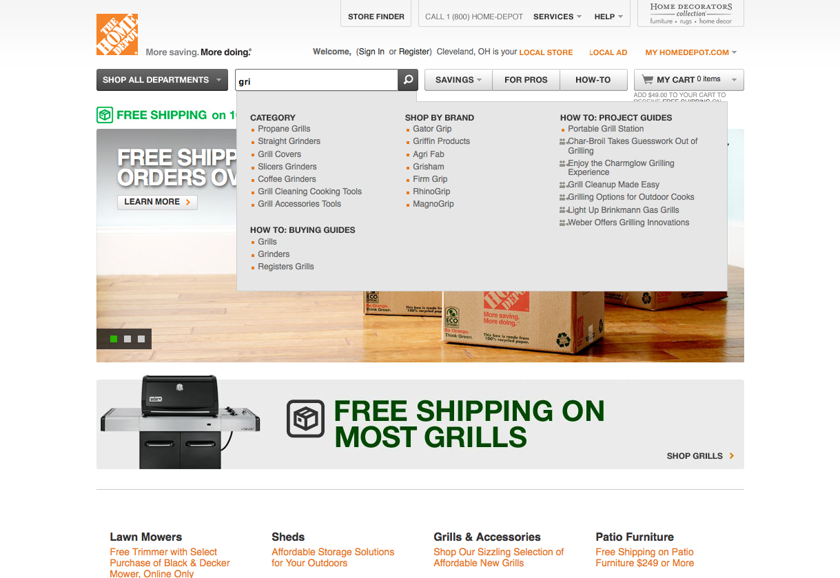 Searching for the term "grill"Immediately upon entering a few letters the first match that comes up is propane grills. I assume that if I were to select this that it might take me to an informational page on grills. When I hit enter the following screen shows what actually happened.
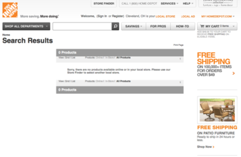 No results for "grill"Not only does this page provide conflicting information (there is really nothing on the Home Depot web site about grills?) but it provides no other options except to search again. If I did not know that what I was looking for was available I would assume that this was the end of the road. As it is I am now more likely to do use a third-party search engine like Google to develop a scent.
Some solutions
The problem could have been avoided in a couple of ways. While the autocomplete feature is definitely helpful there appears to be a disconnect between the terms there and whatever is in the search index. By including these keywords I would have been directed to the right place.
Another suggestion for those developing interfaces is to avoid dead ends. Instead of No results found offer up alternative suggestions. If there really is nothing to suggest then provide a list of popular search terms or a way to get help. At no point should the experience hit a dead end unless that is a key feature of the interface.
One takeaway lesson from this experience is that there is no such thing as the perfect interface. Maybe I am an exception to the rule - I have to imagine that at some point Home Depot did some usability testing on their system. On the other hand it does show there is always room for improvement. Here's to hoping that Home Depot is one of them soon.
Myths of multitouch
Recently at the IA Summit in Denver, Colorado I had the opportunity to present several months worth of research into the myths and assumptions behind multitouch interfaces. Distilled down into a few key points the poster seemed to be well recieved by everyone who stopped by. I am now posting it here for the world to see in the hopes that it will continue to spark discussion and debate.
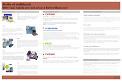 Myths of multitouch interfacesI've also included some links to key papers that I found along the way. While some parts of them may be a bit dry and academic in nature the content is worth a closer look.
A study in two-handed input by Buxton, B. and Myers, B.
Two handed virtual manipulation by Hinckley, K., Pausch R., et al.
Integrality and separability of input devices by Robert, J. Sibert L., et al.
Just do it
I've gone through many iterations trying to get that "just right" presentation. Now it's time to step out, take a risk, and just go for it. This site represents an attempt to synthesize several years of ideas and experience into something that might be valuable to others besides myself. Besides a place to boost my ego by posting portfolio pieces I hope to start a discussion on how user experience can go beyond the web to improving all our daily contact points.
My history as a programmer gives me some good insight into the "quick and dirty" mentally that pervades the mentality of many people even today. Despite the rise of concepts like "information architecture", "visual design", "user experience", and "usability" there still seems to be a big disconnect between what is going on and the potential for better experiences. Originally I thought that the library domain would be fertile ground. However I see the need for change everywhere I go.
It might get messy but isn't change always? Bear with me on this wild ride as I share my day to day experiences trying to solve the tricky and difficult problems out there.